
ILR Lockup and Wordmark

We introduce ourselves differently depending on who we’re talking to. To someone unfamiliar with our school, we might open with our association with Cornell University. To talk about our impact in the world, we might be bolder. Among our own community, we might use a nickname.

ILR Lockup

For outward facing communications in which it’s critical to highlight the connection between ILR and Cornell University, lock up the seal and ILR wordmark according to the University’s brand guidelines. Always follow Cornell’s spacing guidelines when locking up with the seal. Locking up is not mandatory, but the seal should appear with primacy and proximity to the ILR wordmark. Visit the Cornell University Brand Center for guidelines relating to use of the seal.

Wordmark

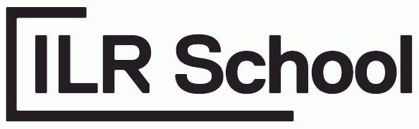
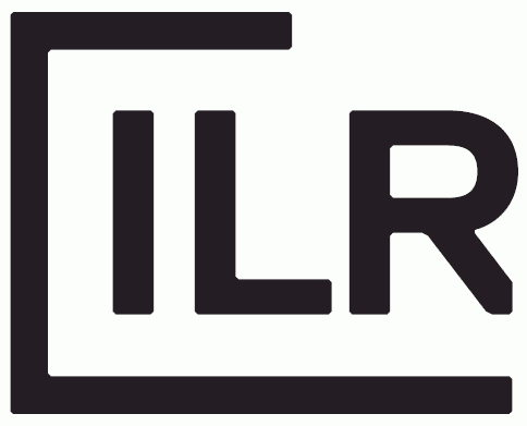
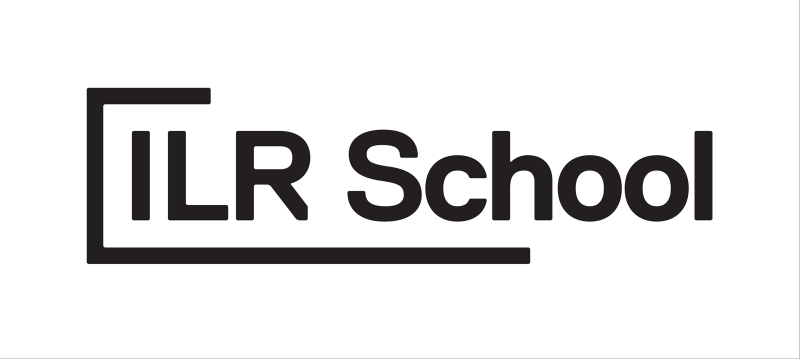
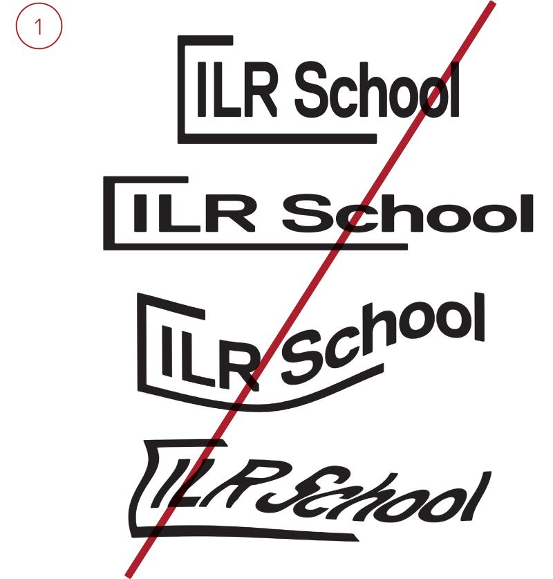
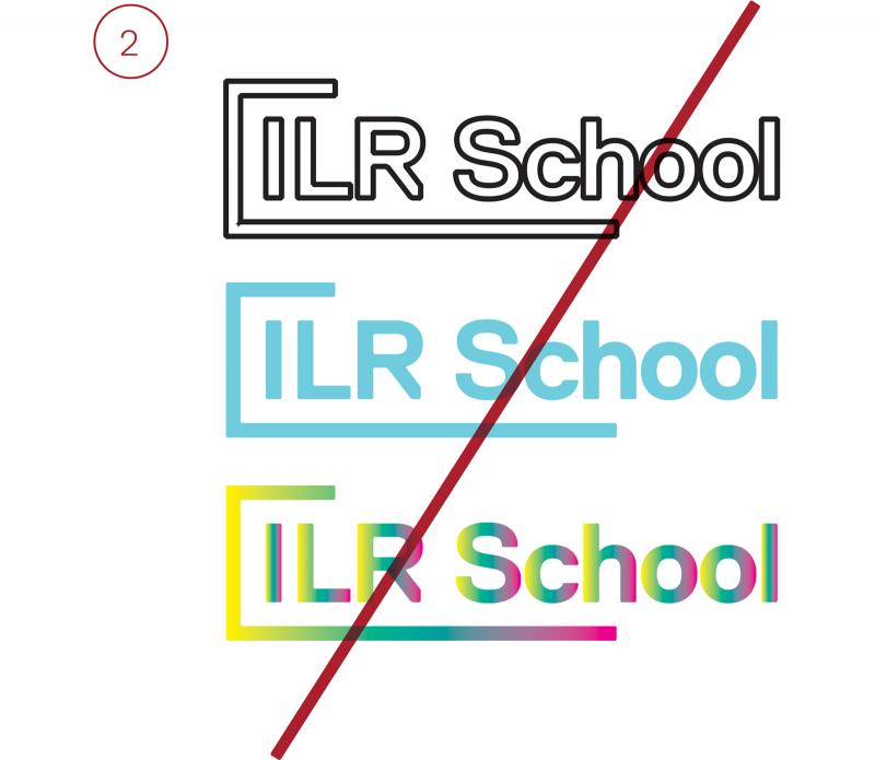
ILRies don’t think inside a box, so neither should our wordmark. We are in open dialogue with the world, which is reflected by the open frame.

In its look, the open frame echoes the shape of the terminals of Replica bold, with beveled corners.

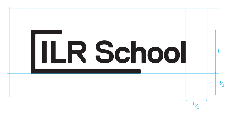
The frame’s top bar always starts at the midpoint of “ILR” and its bottom bar ends at the midpoint of the second word. In the primary case, the second word is “School”, but the wordmark can also accommodate different name combinations, such as ILR’s sub-brands.

Wordmark Variations

We also have a nickname to use in internal-facing communications, when our audience is already familiar with the ILR School.

This is the only exception in which the open frame terminates at the end of a word—because, in this case, “ILR” isn’t followed by another word.

As our brand evolves, and becomes more recognizable, consider using the nickname mark with greater frequency.

Clear Space

To protect the legibility and visual integrity of the wordmark, always observe a margin of clear space around it. Use half the height of the wordmark to measure around the lockup.

The exception is when the wordmark locks up with the Cornell University seal.

See Brand Architecture for details.

wordmark-clear-space

Wordmark Color

The basic wordmark should only appear in black on light backgrounds and white on dark backgrounds. Please see the brand architecture section for color usage on sub-brands. 

Achieve a clear contrast when applying the wordmark to a field of color or an image. 

wordmark-white
wordmark-black-reversed type
wordmark-gray-black-type
wordmark-navy-reversed-type
wordmark-light-green-black-type
wordmark-red-reversed-type

Wordmark Dont’s 

Always use approved digital vector artwork. To ensure the brand retains its integrity and clarity, avoid any unapproved variations or distortions. 

  1. Don’t modify, stretch, deform, warp, or rotate.
  2. Don’t recolor or outline. 
  3. Don’t violate minimum clear space. 
  4. Don’t use image effects such as glows, tridimensional effects, or blurring. 
  5. Don’t break or rearrange wordmark elements. 
wordmark-do-not-examples-1
wordmark-do-not-example-2
wordmark-do-not-examples-3
wordmark-do-not-examples-4
wordmark-do-not-example-5

Wordmark Sizing 

Use these minimum widths to ensure legibility at small sizes in print or digital applications. 

wordmark-sizing-print-screen
nickname-logo-sizing-print-screen