Photography
Photography plays a crucial role in bringing the ILR School brand to life. Our photos should always feel like us— authentic, vibrant, and human. This section includes tips on how to select images, create dynamic collages, and deploy monotone as a design element, as well as how to use photography in digital and print applications.
Selecting Photos
Photography is a mirror of our personality. Following these tips and tricks will keep it consistent and recognizably us:
- Whenever possible, maintain high-resolution quality and natural light.
- When it comes to photo editing and retouching, be subtle.
- Feel free to use stock photos, but avoid staged, cliché imagery that could pair easily with any college or university.
Fruitful Categories
Six photo categories bring our school’s history and future to life:
- Labor/Working class
- Corporate/Global
- Campus life
- Historical events
- Future of work
- Detail/Texture
Fruitful Categories
1. Labor/Working class
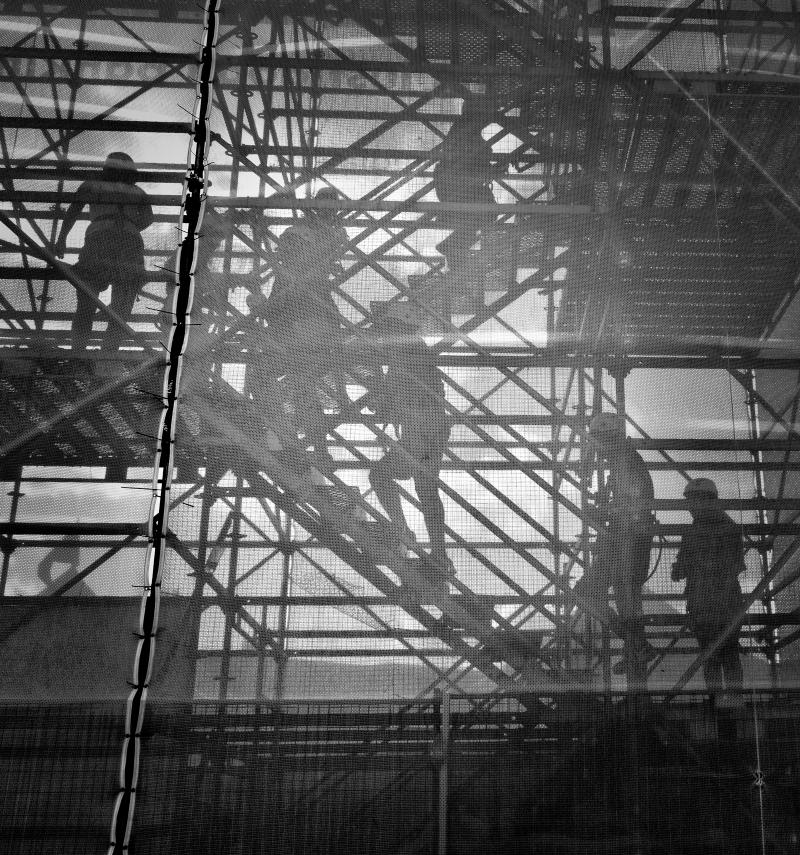
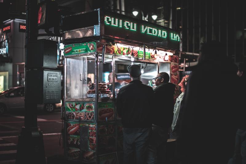
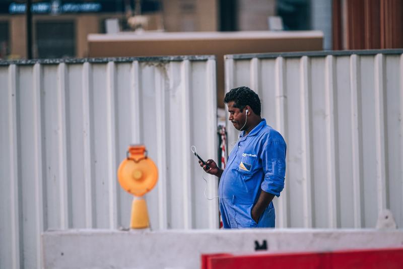
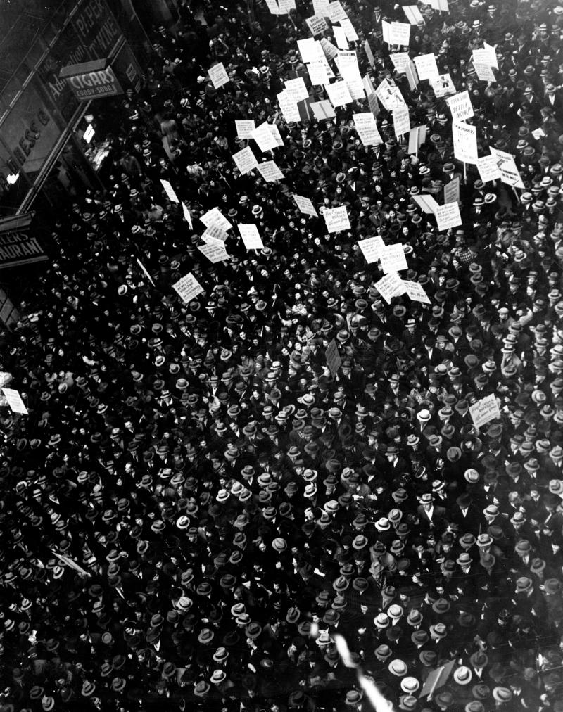
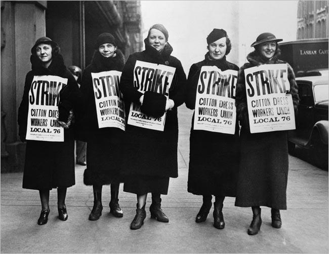
Look for photos that convey a range of what labor has meant over time, from trade unions, to workers on the picket line, to the labor movements of today. Highlight the subject’s story, and favor natural settings with interesting textures or expressive people.
Fruitful Categories
2. Corporate/Global
Striven to represent a diversity of work roles across a plethora of industries, from entry-level employees to executives in the C-suite. Above all, showcase people, in context, wherever they may work in the world.



Fruitful Categories
3. Campus life
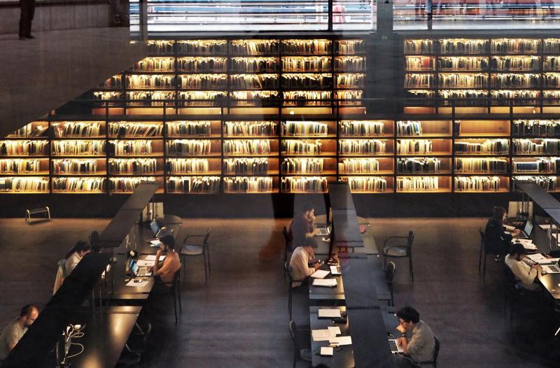
Celebrate the vibrancy of academic life on all our campuses. Let’s show students at work— debating in the classrooms and institutes, making impact at their internships, and leading campus clubs and initiatives. Photos of our campus facilities and atmosphere should feel authentic (showing snow is okay). Above all, try to capture intimate and spontaneous moments of connection that represent the diversity of our student body.


Fruitful Categories
4. Historical events
Draw on archival images, including photos from ILR’s history, to reflect our mission. The principles and values evidenced in this type of imagery are what allows us to face our future with confidence.

Fruitful Categories
5. Future of work
To communicate the evolving nature of work and the workplace, look for photos that depict edge industries and convey aspirational areas for ILR’s curriculum, research, and outreach. Be provocative.



Fruitful Categories
6. Detail/Texture
Build up a stable of details, abstracts, aerial shots, and textural photos to help tell compelling stories. Highlight the industries, landscapes, buildings, as well as different kinds of work being done across the globe. These photos will become especially useful when used in collage and with color overlay (see below).



Collage
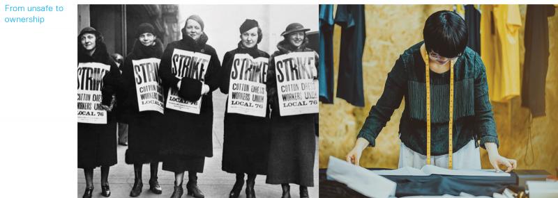
Combining 2–3 photos to create a single visual statement is a way to embody multiple and diverse perspectives—a quality that’s foundational to ILR’s personality. The aim of juxtaposing imagery is to highlight the diversity of the school—faculty, students, methodologies, and real-world impact. A single collage can create a rich conversation about ILR’s cross-disciplinary approach, and help us tell stories of hybrid topic areas, roles, and points of view.
Collage
Here are a few suggestions on how to pair images:
- Consider the message the images convey together.
- Emphasize tension between images to create a dynamic conversation, not a binary choice or oppositional approach.
- Try pairing a busy image with a textural or detailed one to create a sense of humanity and scale.
- Whenever possible, include people.

Color Overlay
Our photo style also favors the technique of overlaying a color screen on top of black-and-white imagery. Color overlays let us deploy type over photography in a way that’s readable and texturally delightful. It allows for texture accents and visual variation, which we can use as a divider to differentiate content. And it enables us to create cohesion across a wide variety of photos.
Color Overlay
How to effectively use color overlays:
- Use across an entire section of content—news stories, initiatives, etc.—to make each entry feel like part of the same visual family.
- Use only to enhance clarity, and avoid when it actively works against enjoyment and comprehension.
- Always consider the legibility of both photography and text.
See the color palette section for approved colors.


Photo Resources
Additional photography guidance and resources are available through the Office of Communications and Marketing.